Getting a Photo to Survive a Photocopier
Why photographs lie on a copier
A photograph contains thousands of tones — shadows that blend imperceptibly into midtones, highlights that trail away to nothing. A photocopier contains toner, a roller, and a binary decision: mark or don't mark. The machine cannot render a gradient. It can only approximate one by breaking continuous tone into a pattern of dots, a process called halftoning, and it does this automatically, badly, and without asking your permission. Understanding that gap — between what a photo is and what a copier can do — is the whole game.
The copier's default halftone is calibrated for office documents: black text on white paper, sharp edges, high contrast. Feed it a photograph and you'll get a murky grey slab where the shadows used to be, blown-out highlights where detail vanished, and a midtone range that looks like it was processed underwater. This is not a malfunction. It is the machine doing exactly what it was designed to do, applied to something it was never designed for.
The fix is not to fight the machine — it is to prepare your image for what the machine does, not what you wish it did.
Halftone it yourself, deliberately
The copier will halftone your image regardless. The question is whether you let it choose the screen, or whether you impose your own. If you convert your photograph to a halftone before it goes near the glass, you control the dot size, the screen angle, and the frequency. The copier then reads your pre-screened image as a line drawing — black dots on white — and reproduces it faithfully.
The standard approach is to open your image in any capable image editor (GIMP is free; Photoshop is common) and convert it to bitmap mode using a halftone screen. A frequency somewhere between 15 and 45 lines per inch tends to survive photocopying well. Higher frequencies produce finer dots that clog or disappear; lower ones give you a visible, graphic dot pattern that becomes part of the aesthetic — which is not a problem, and is often exactly the point. Zine halftones are supposed to look like halftones. The coarse dot is honest about what it is.
Screen angle matters more than it sounds. The default 45 degrees works for single-ink print, and that is all you need here. Experiment with round dots versus elliptical ones: elliptical dots tend to hold tonal transitions through the midrange better, reducing that abrupt jump from grey to black that ruins faces and sky.
Before you halftone, push the contrast. Bring the blacks down and the whites up — a slight S-curve in levels or curves — so the image has genuine dark darks and clean white whites before the screen is applied. Midtones are where photocopiers fail. The more information you can redistribute toward the extremes, the more will survive the journey through the drum.
What the paper does
Halftones, contrast and the limits of toner.
Making & Printing
Paper is not passive. A coarser surface — cheap photocopier stock, newsprint — will spread the toner slightly, filling in fine dots and muddying tight screens. If you are printing on standard 80gsm office paper, account for that dot gain by keeping your halftone frequency lower and your blacks denser than you think you need. The image you see on screen will always look crisper than what emerges from the tray; budget for the difference.
Glossy paper is not your friend here. Most photocopiers struggle to fuse toner to coated stock reliably, and the surface does nothing for contrast. Uncoated is the better choice, and slightly heavier paper — half-letter format zines folded from 90gsm stock, for instance — tends to take an impression more cleanly than very thin sheet.
A few practical rules
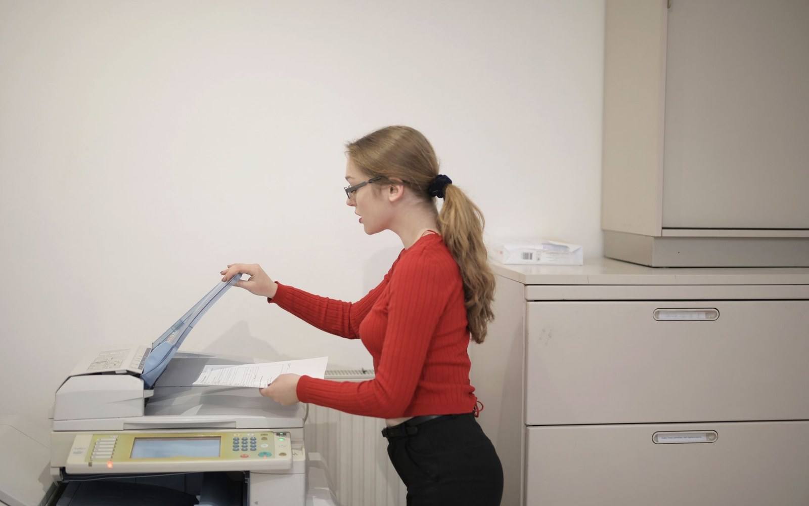
Test one copy before you run a stack. The halftone that looked perfect on screen may require a single exposure adjustment — most copiers have a manual contrast dial or a document-mode setting. Set it to its darkest or a notch below; the default mode assumes you want a faithful reproduction of a colour original and will reduce contrast to achieve it, which is the last thing you need.
Watch for moiré. If you are copying a halftoned image that has already been printed somewhere — cutting up an old magazine, say — the interaction between the original screen and the copier's own screen creates a moiré pattern: that wavy, rippling interference effect. The solution is to scan or photograph the original first, apply a slight blur to break up the existing screen, then re-halftone it at your own frequency and angle. The result will be coarser, but it will be clean.
Embrace what the machine gives you. Some of the most memorable images in zine history are photocopied photographs so high-contrast they are almost silhouettes — faces in deep shadow, hands against white — where the copier's compression of tonal range became the aesthetic, not an obstacle to it. The photocopier is not a neutral reproduction device. It is an opinionated one, with its own strong sense of what an image should look like. Once you understand that, you can work with it rather than against it, and the results are distinctly, unmistakably zine.