The Photocopier Is the Instrument
Playing the machine, not fighting it
The photocopier does not reproduce your original. It interprets it — and understanding the difference is the whole game.
What a copier actually does is scan reflected light and deposit toner where it expects darkness. That process is fast, cheap and nearly universal, which is why it built zine culture. But it compresses everything it touches. Midtones collapse. Soft pencil greys vanish. Photographs smear into black puddles or bleach into nothing. A photocopier is not a neutral relay; it is an opinionated instrument with strong views about contrast, and the makers who work well with it are the ones who treat it that way — like a bandmate with a limited range and a very distinctive voice.
Contrast is the first thing to understand. The machine wants black and white with as little grey as possible between them. Line art, solid fills, heavy ink, dense marker — these survive. A careful pencil sketch, a watercolour wash, a printed photograph straight off the page: these do not, at least not without help. The correction is not subtle. Push your originals harder than you think you need to. Draw with the blackest pen you have. Fill areas you might otherwise leave as a graduated wash. The copy will pull back from wherever you push, so push past comfort.
Photographs need a different approach entirely. A grey continuous-tone image fed into most office copiers emerges as a blotchy mess — too dark in the shadows, blown out in the highlights, and muddy in between. The traditional solution is the halftone: breaking the photograph into a grid of dots before it ever meets the copier drum, so the machine reads dots rather than tones. Coarser screens survive better; finer screens can clog. If you are printing from a home laser printer first and then copying, the dot pattern is already baked in and survives the second pass reasonably well. The halftones guide covers the mechanics in detail, but the practical takeaway is simple: never expect a straight photograph to survive the machine. Convert it first.
Toner, contrast, and working with what the machine does badly.
Making & Printing
The machine's personality is the aesthetic
Here is where thinking flips. Once you understand what the copier does badly, you can do it on purpose.
Toner dropout — the slight fade that appears when a drum is running low or a page is dense — creates texture that no digital tool quite replicates. A solid black rectangle photocopied twice develops grain and warmth. Text run through a third or fourth generation picks up a slight roughness at the edges that reads as urgency. Folded paper fed at a slight angle produces a shift. These are not flaws to apologise for in your colophon; they are the marks of a specific process, the way a risograph's misregistration is not a defect but a character.
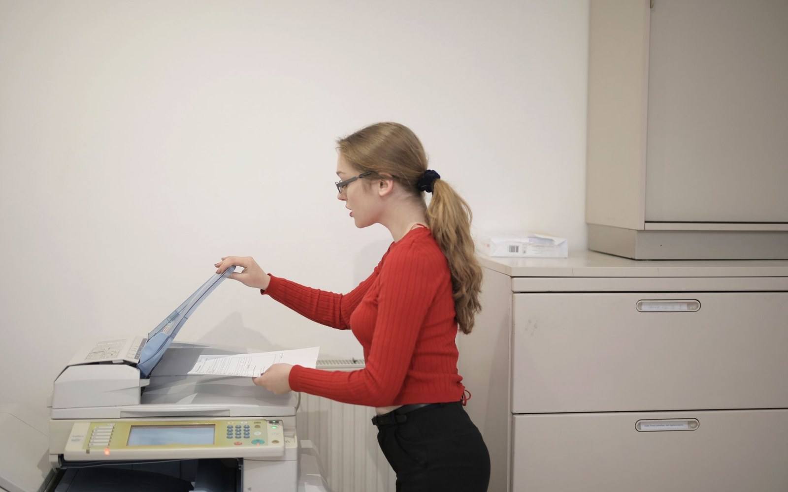
Many zine makers lean into this deliberately: making originals slightly too dense so the copier's compression creates contrast rather than destroying it; using correction fluid to block areas of a photocopy, then copying the result again; layering found imagery with hand lettering so the machine's flattening melds them into something new.
The physical relationship matters too. A copier glass that is not quite clean will deposit a faint shadow. Pressing too lightly leaves a lighter patch. These are repeatable and therefore useful. The machine has a fingerprint, and if you make several runs, you will learn it.
A familiar piece of office equipment turns out to be one of the most characterful printing instruments available to a maker on a small run. You are not producing a facsimile. You are producing a photocopied zine, and those are different things, made differently, read differently, and kept for different reasons.